
I decided to take on this task- I was curious to discover how creative I could be and to what extent. The experience was thought-provoking. I’ll take you behind the scenes in a moment, but first, please take a look at the final version of the logo:
At first glance, any logo may appear straightforward ; however upon examining the details of its creation and the significance behind its design, one finds it much more fascinating. This deeper understanding allows us to appreciate the logo from its viewpoint. Does it make sense?
So, what does the name “Hellokea” sound like to you? What do you think the product is about? Does my logo design provide any clues in your mind? I will discuss shortly, stay tuned!
Behind the scenes - In the process of designing this logo, I did not simply create it spontaneously. Initially, I ensured that I had clear mental sketch of the product's concept. Next, I utilised only paper and pencil to develop some significant themes for the logo. There are numerous approaches to logo creation; choosing from various styles such as modern, artistic, contemporary, vintage and so on, proved to be pretty challenging. For me, from picking a colour palette, art style and methodology to selecting a style for a logo design, it felt like I was literally climbing on a huge mountain. Fortunately, this challenge did not stop me; rather my passion for creative work intensified, fuelling my enthusiasm. As I was merely at the beginning stage, everything was unfamiliar to me, yet I remained focussed and determined to do it.
I'm providing all of the logo concepts that didn't work out so you can see how the process stirred up my curiosity. What I cherish most is customer happiness. 😃
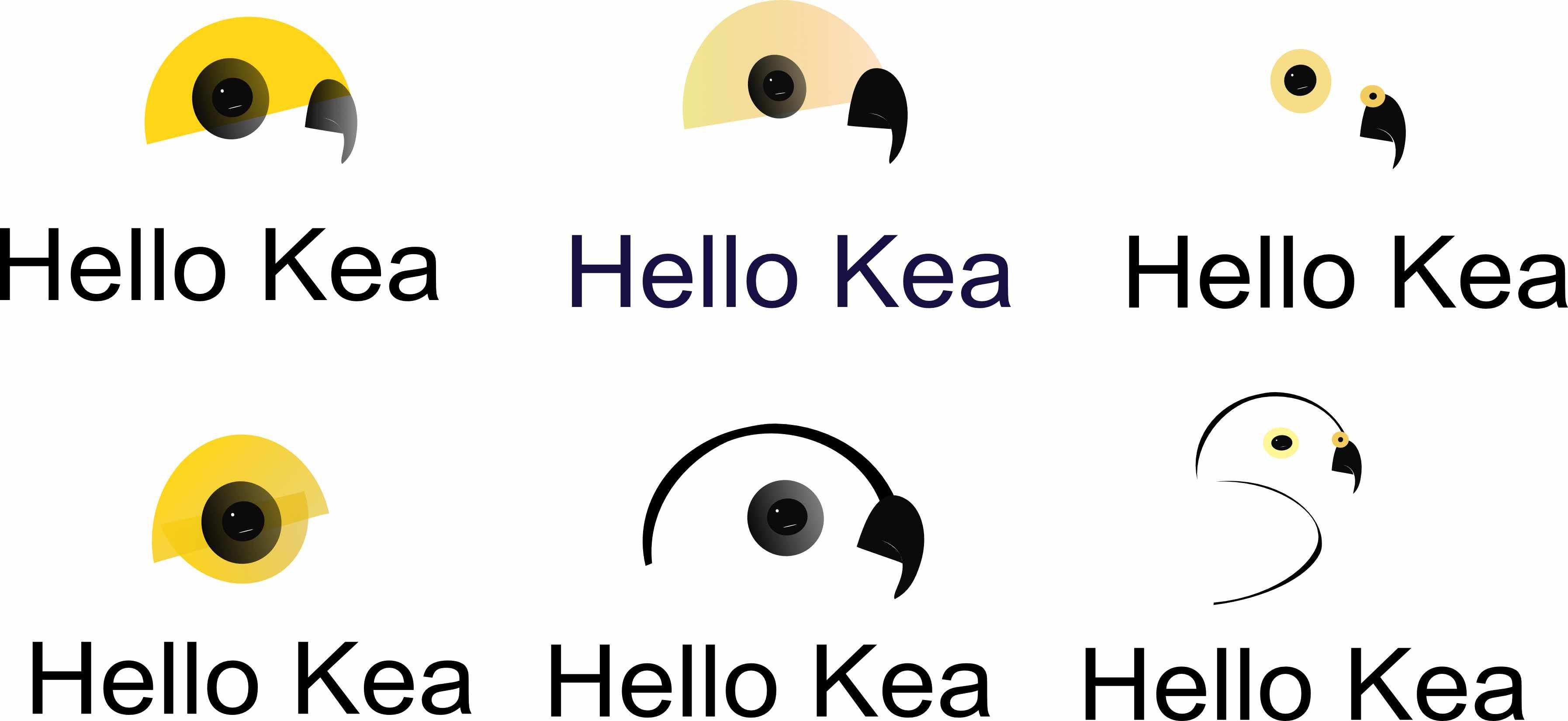
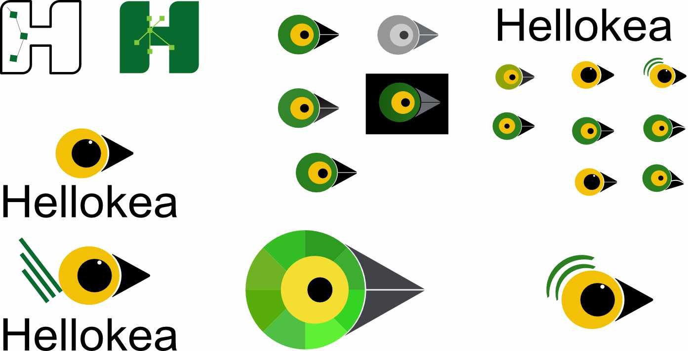
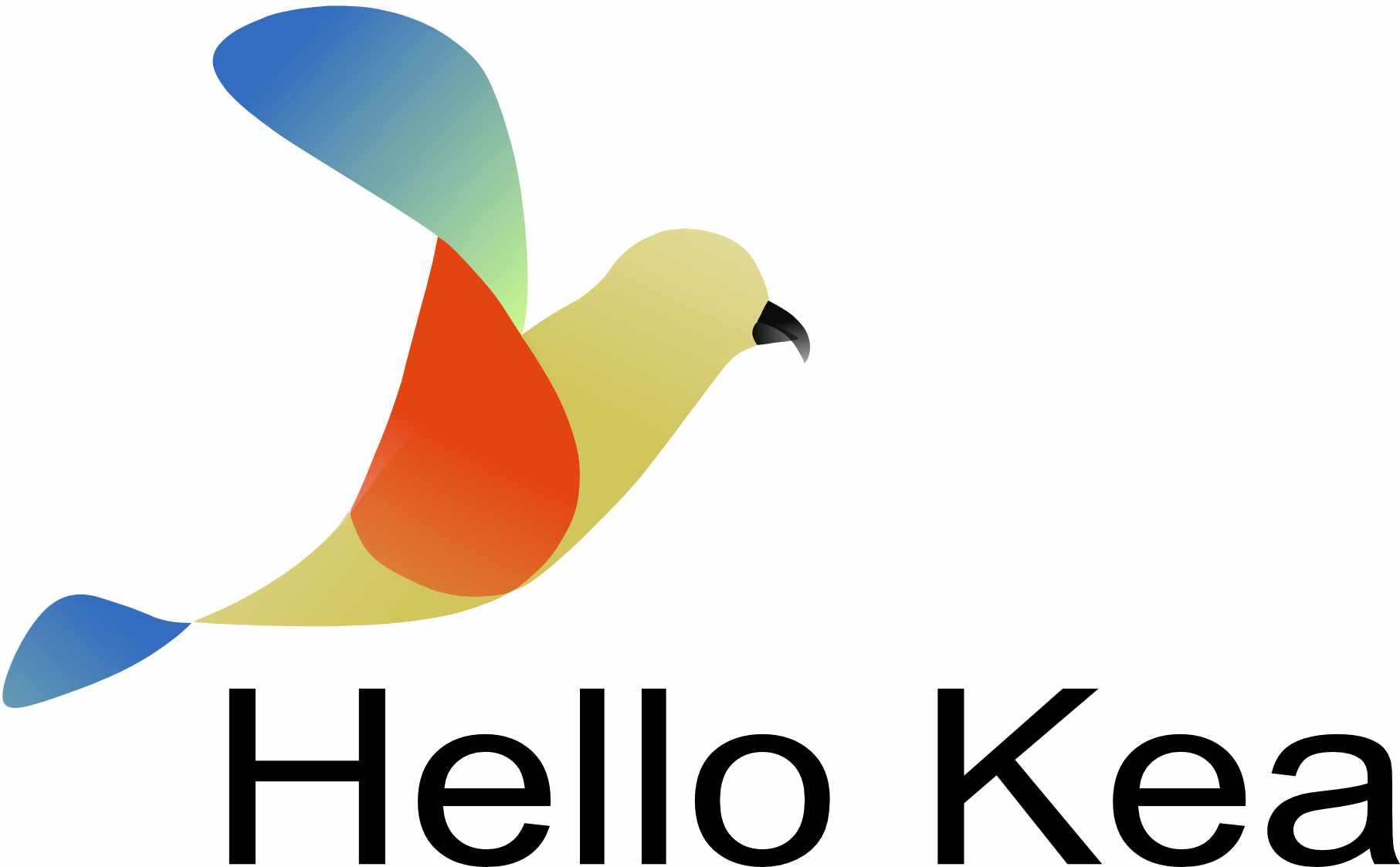
Logo selection criteria- First few options I came up with represented the website's name or we could say it was a straight interpretation of the name of the website-the bird, Kea. However, once I finished sketching the bird's face, eyes and the beak in several ways, we discussed and agreed to try again. I experimented with numerous approaches, including adding the text, altering the colour to see how it would seem on various backgrounds, adding slight strokes to reveal its wings and so forth. However, nothing seemed to satisfy. The last one above- full bird, felt somewhat fine although it did not exactly match our thoughts. In the end, the present logo which was selected with a concept in mind, was the obvious winner.
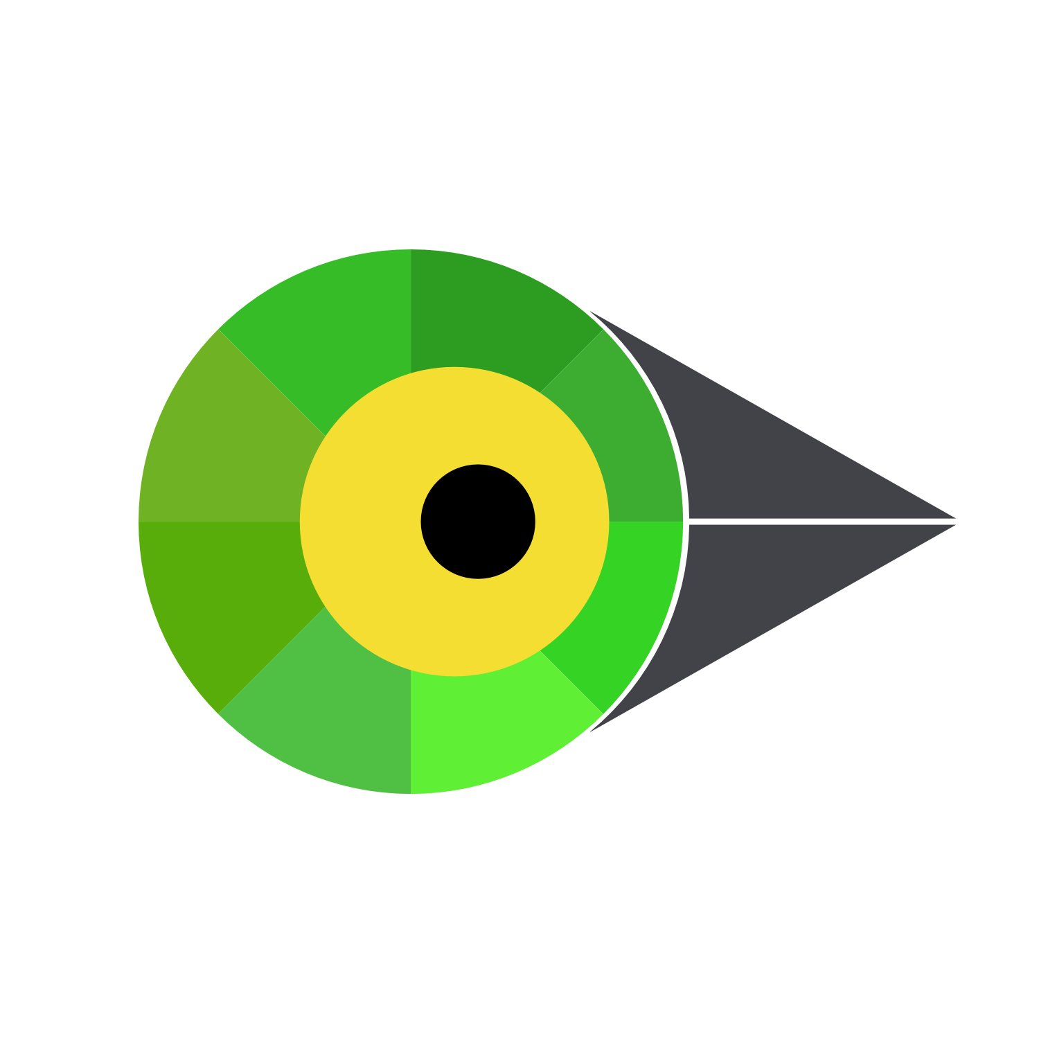
The concept- Here it goes:
Outer circle- Different shades of green and yellow that you see in the logo represents the shades in the kea's wings. Product's point of view-Multiple product's communication made easy with one tool-Hellokea.
Inner two circles- The yellow and black circles represent the bird's eye. Product's point of view- Juggle effortlessly multiple addresses in a single view with email management solution feature.
The beak- Keas utilise their beak alongside with their cognitive talents and perseverance to study new objects and solve challenges. Product's point of view-From the biggest projects to the smallest treasures, Hellokea's platform has you covered with utmost humility and unshakeable confidence.